Looker-Business-Analyst Looker Business AnalystExam Questions and Answers
An analyst is trying to rank companies in an Explore and visualize the rank as a column chart. The analyst selects the Brand Name dimension and the Rank dimension. They then select the column chart visualization type, but receive the error “Measure, time or numeric field required: Column graphs require at least one dimension or for the first dimension field to be of type: number or type: time”.
How can the analyst resolve this error while showing the rank as a column visualization?
An analyst needs to filter the sum of the sales between 12 complete months ago to the last 9 complete months ago.
How can the analyst create this filter condition?
An analyst needs to analyze the ecommerce quarter-over-quarter order growth. Two fields are given: Order Created Quarter and Order Count.
Which table calculation function should the analyst use to calculate the quarter-over-quarter order growth?
Two users report seeing different results on the same dashboard.
Which three configurations could explain these discrepancies? (Choose three.)
The query below shows how many uses purchased an item from each of two clothing departments.
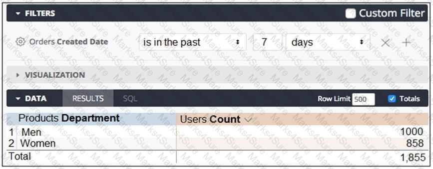
Why are the total and sum of the rows unequal?
An analyst has created a dashboard that needs to be integrated into the company’s internal support portal. The dashboard should match the style of the support portal.
How should the analyst display the dashboard in the style of the support portal without changing the style of the tiles in Looker?
Users find it difficult to distinguish the dashboards they need for tracking sales performance. There are more than 30 operation-related dashboards in the same folder.
What should the analyst do to improve the navigation experience?
An analyst creates a column chart showing the count of total orders and the count of returned orders on each date. The number of returned orders is much smaller than the number of total orders, so the columns for the returned orders are short and it is difficult to compare all the columns visually.
How should the analyst ensure that the differences between returned order counts for each day are more visible?
A CEO wants to receive a daily email with the existing executive dashboard to review on a mobile device on the way to the office.
What should the analyst do to optimize the dashboard for mobile viewing?
PDF + Testing Engine

Testing Engine
PDF (Q&A)